FitApp
A beautifully crafted Framer website template perfect for AI SaaS businesses looking to showcase their innovative products and services.

About the Proof of Concept
An end-to-end mobile design and usability study that optimized the e-commerce checkout flow for an urban fitness app. Leveraged affinity mapping and iterative testing to combat cart abandonment and streamline navigation.
The Friction in Mobile Fitness Procurement
While busy fitness enthusiasts wanted to purchase local and on-demand classes to fit their tight schedules, early metrics showed severe drop-offs during the final transaction stages. Users encountered significant navigation roadblocks, leaving them confused by basic e-commerce options and causing hesitation right at the point of sale.
An inspection of the legacy framework revealed a critical user experience flaw: the interface lacked an intuitive navigational structure. It completely omitted essential confirmation feedback like digital receipts, forcing a blind purchase pathway that directly triggered cart abandonment behaviors.


The Affinity Mapping & Testing Framework
To engineer an optimal checkout experience, I launched two rounds of usability testing with five remote participants over a multi-week deployment sprint. By documenting real-time user tasks and processing qualitative data via rigorous Figma affinity mapping, I identified core mental models to completely overhaul the digital checkout architecture.
Streamlining Interactive Call-to-Actions
Initial user research exposed severe choice paralysis: 4 out of 5 testing participants were actively derailed by a confusing interface that forced them to choose between ambiguous "Buy" and "Pay Now" actions on a single screen. Users explicitly noted that the conflicting language disrupted intuitive task navigation.
I mitigated this transactional friction by consolidating the interface into a single, highly explicit 'Confirm Payment' button array. This strategic alteration was backed by a secondary 'Continue Shopping' safety loop, matching standard user expectations and cleanly defending against standard 69% e-commerce cart drop-offs.

Validating the End-to-End User Flow
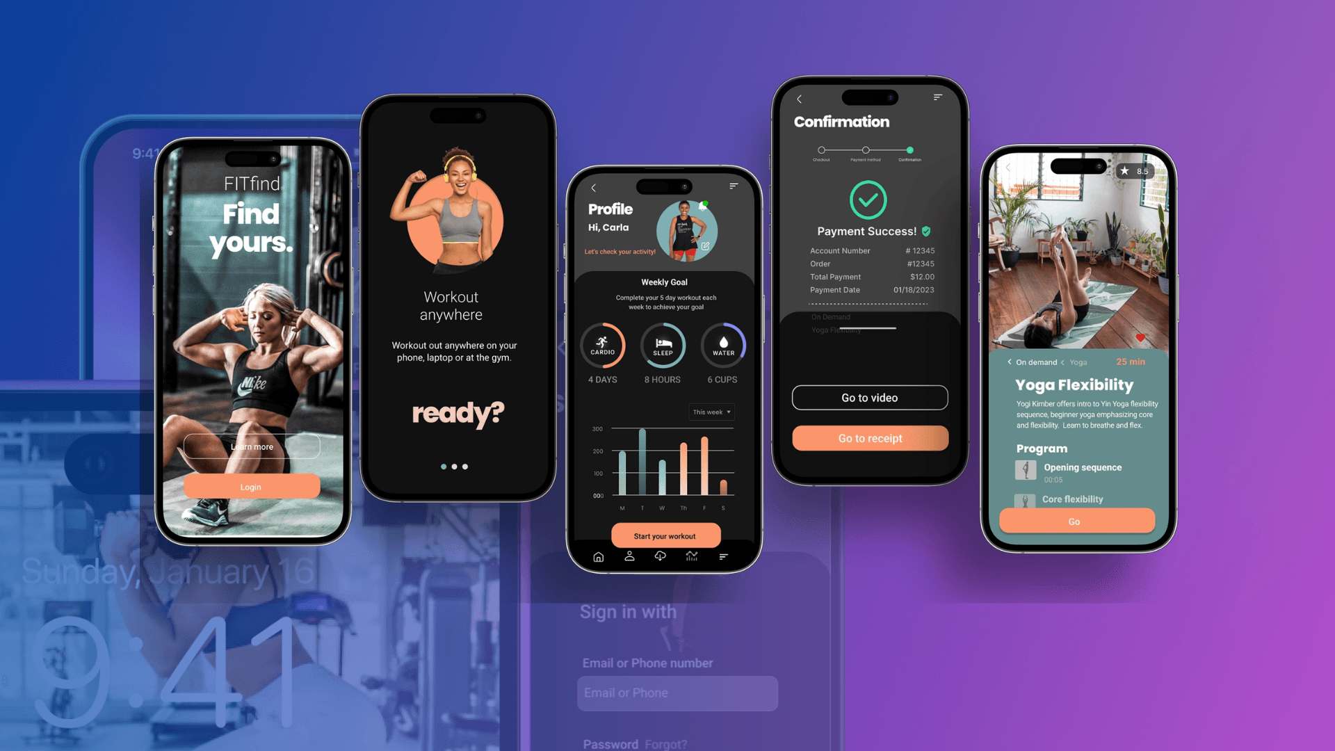
To prevent users from getting lost inside the mobile hierarchy, I transformed the loose layout into a cohesive navigation framework. I integrated a sticky bottom navigation bar and mapped explicit profile shortcuts directly to core features, including On-Demand Hubs, Location Finders, and account settings.
Furthermore, I addressed explicit user requests by engineering a dedicated post-purchase 'View Receipt' confirmation screen. Providing this immediate validation gave users complete clarity over their financial data while seamlessly leading them into downloading or watching their content.
Transitioning to a Premium Interface
With user behaviors validated, I advanced the gray-box wireframes into an elegant, dark-mode high-fidelity product system. Strong typographic hierarchies, breathing space, and vivid fitness imagery were applied across custom-engineered activity trackers and interactive grid systems to maximize sustained daily user engagement.
Data-Proven Design Scaling
The final interactive prototype successfully resolved every targeted navigation roadblock, drop-off point, and task bottleneck discovered during initial research sprints. By removing layout ambiguity, the updated user flow systematically lowers task-completion times and effectively minimizes user error rates during critical checkout cycles.
Product Growth Potential: This case study establishes an optimized design system that scales seamlessly for future fitness feature rollouts. The conversion-centric architecture is fully prepared for future user research phases, including tracking live system usability scales and maximizing conversion metrics for high-volume consumer rollouts.
Read the Full Case Study: Download Case Study
—————————————————————————————-
Need to Transform User Friction Into Conversions?
Clunky product architectures and confusing checkout steps are actively costing your business revenue every single day. Let's look at your software, find your user drop-offs, and engineer an interface your customers love using.